alexander funds
ALEXANDER FUNDS HAD BUILT A STRONG REPUTATION OVER 16 YEARS, BUT ITS BRAND LACKED A CLEAR, DIFFERENTIATING STORY IN AN INCREASINGLY CROWDED CREDIT MARKET.
Despite a recent refresh of the brand guidelines, the challenge was to sharpen its positioning and better articulate its expertise and philosophy.
At the core was the idea that stability is the result of craftsmanship. A discipline refined over time, where every decision is deliberate and every step precisely considered. Craftsmanship creates stability. And stability earns trust. This established a more distinctive and meaningful territory, moving beyond generic category cues and reinforcing credibility.
The creative expression brought this to life through stunning, abstracted close-ups of precision tools. Rather than literal interpretations of ‘craft’, the visual direction focused on control and resilience, reflecting the rigour behind every investment decision. This became a distinctive and cohesive visual system across the website and key adviser materials, supported by quietly confident, benefit-led messaging that sharpened understanding and strengthened appeal.
Website home page

Website - About us
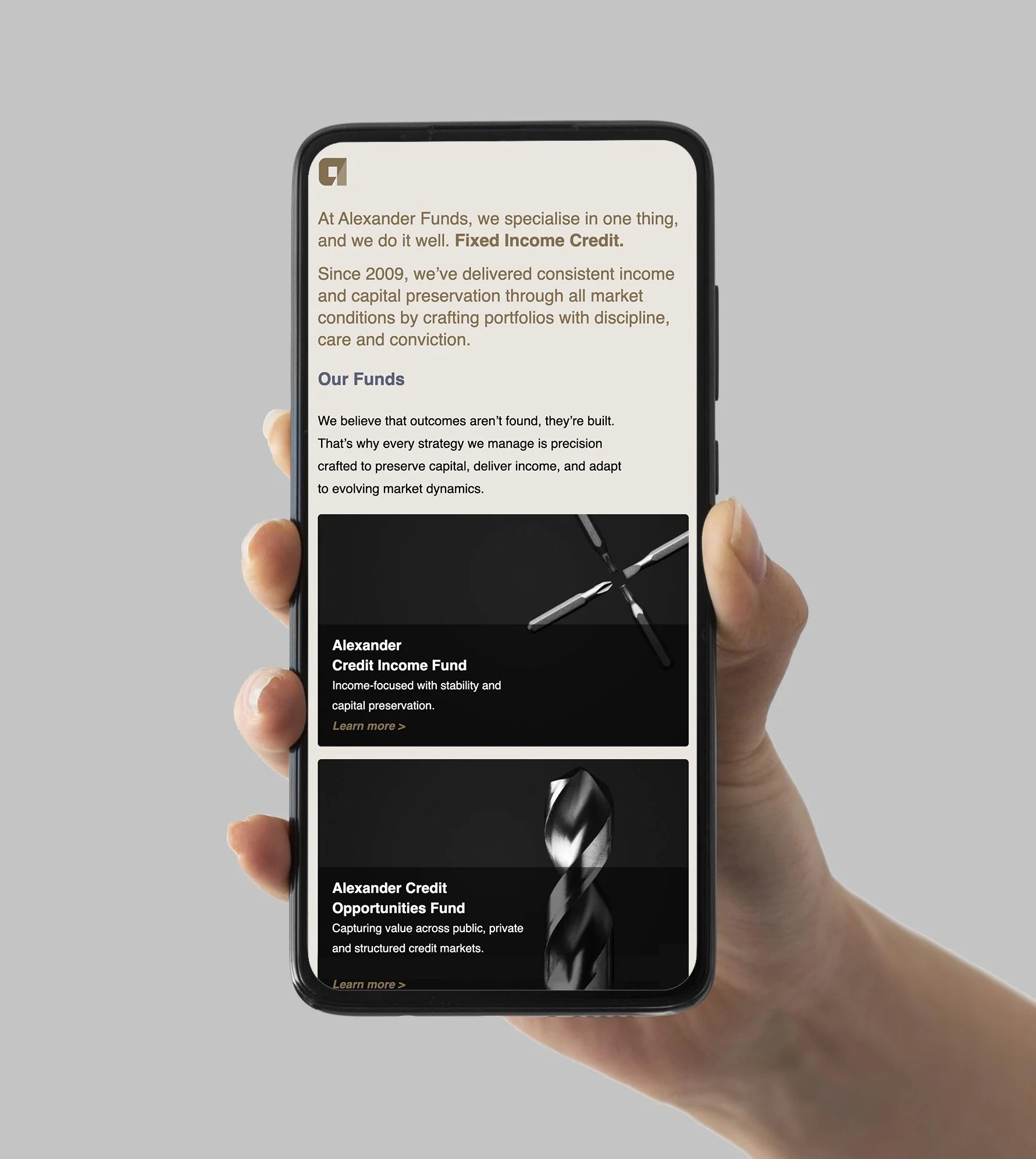
Website - Fund page
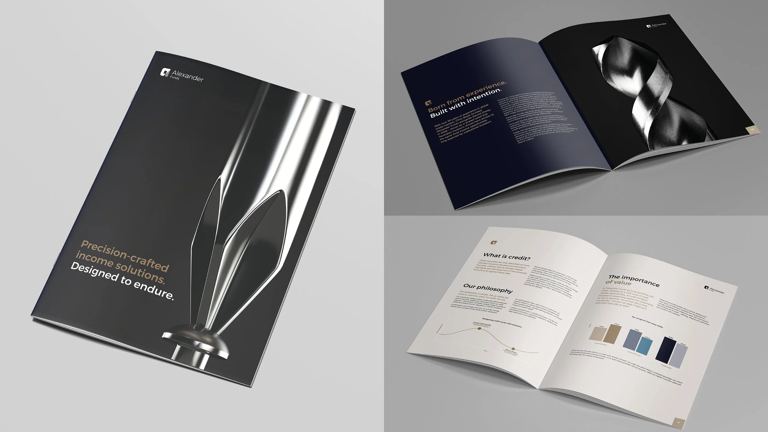
Corporate brochure
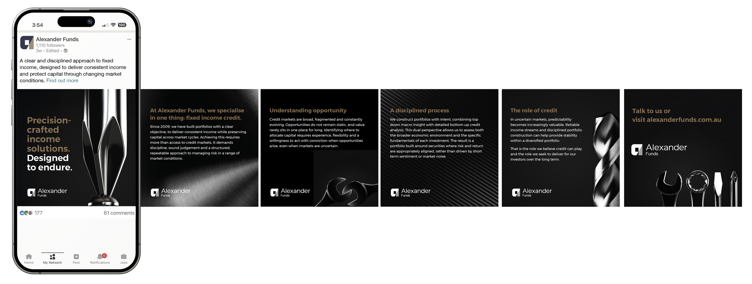
LinkedIN brand re-launch
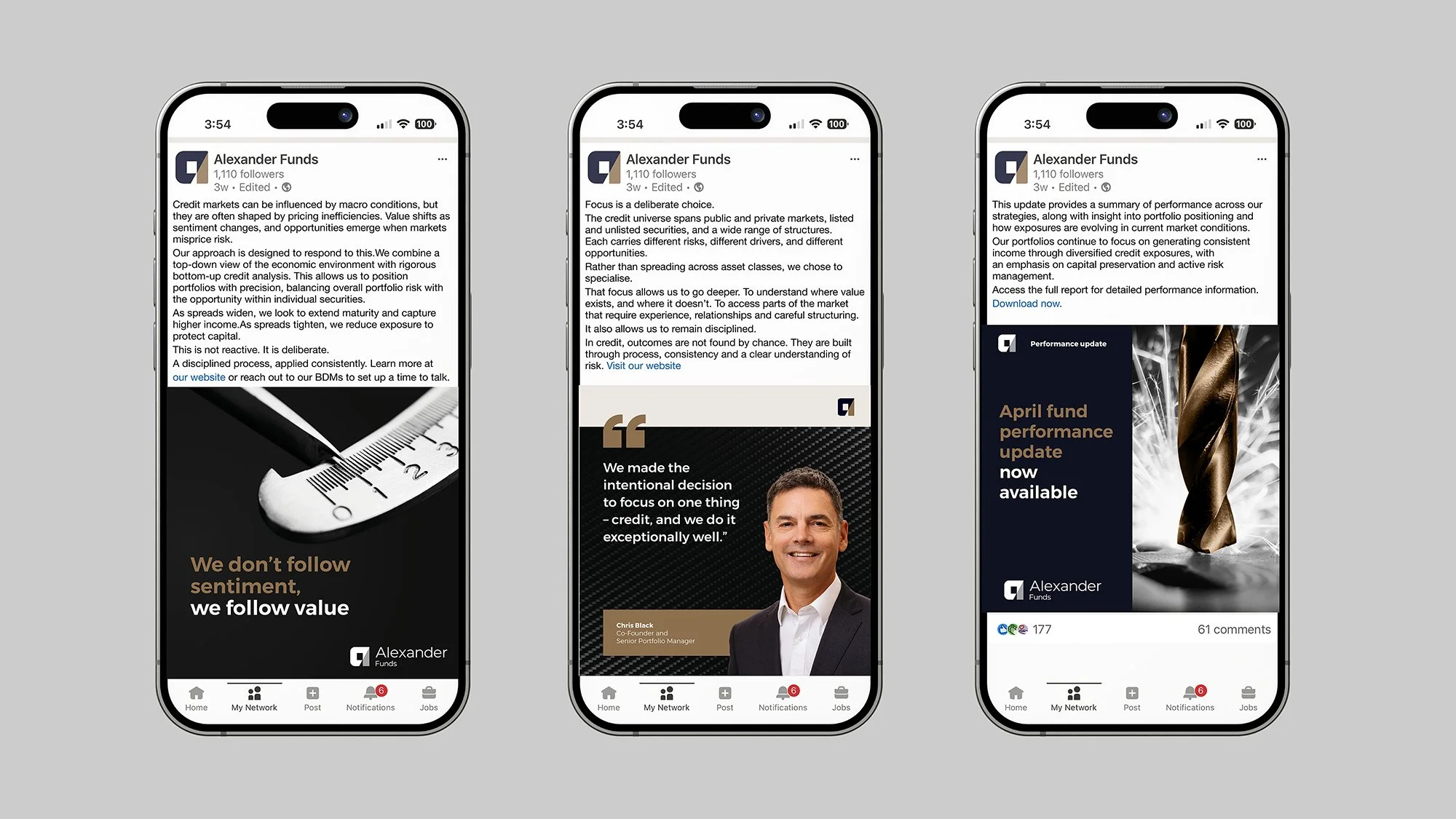
LinkedIN BAU